MyBus Google Map

This post originally appeared on Orphan Road.

As promised here is an updated on my independent study. Since I meet with Prof. Dailey in the CSE department my studies have mostly focused on Mybus and how the information that is already there can be better communicated and used by riders.

As I documented earlier I first focused on how print information both at the stop and in leaflet form could look, which can bee seen here and here.

MyBus Google Map

Since then I have been focusing on what the online information should consist of and how it should be communicated. I decided that the online component needs a better way of intuitively and quickly finding the mybus information, which resulted in the google map that I created. Currently mybus stop ids are in a tabular form split over 8 different webpages, which really isn’t too easy to use.

My map includes all 1020 mybus timepoints. Each marker is linked to the corresponding mybus website, which a user can then bookmark. The next step is to improve the arrival time interface to a more initiative countdown or graphic format. I have a good idea of what I want to do but I’m trying to figure out the technical aspects right now.

Updated MyBusSpot

This post originally appeared on Orphan Road.

Bus Stop

Thanks to Frank for the ideas. Now you can just write in the number. I kept the black because I think that there are situations were a stencil is more appropriate and white letters look better in that situation.

Mybus SMS System Map

This post originally appeared on Orphan Road.

Over the last few days I have been working on creating this map for my independent study. What I tried to do is combine a simplified system map with the Mybus SMS service.

Test Map

I realized through my studies that transit information consist of spatial and temporal information. Thus you have a route map to show where the bus goes and you have a table to show when the bus will be there. Subway systems essentially eliminate the need to know temporal information because they come so often. This allows them to simply focus on the spatial aspect of the transit system which is much easier to understand. That is why everyone loves subway maps. Using Mybus SMS I’m able to do the same thing.

This map only covers downtown, capitol hill and the u district but if I get a good reaction I will make a city wide map. Please let me know what you think.

Metro Mybus on iPhone

This post originally appeared on Orphan Road.

I found this web application for the iPhone last week (http://www.sofianehassaine.com/iPhone/BusTracker/). It takes all of its information from the UW ITS Mybus program, however it improves the interface by leaps and bounds. All you do is choose your location and it will show you estimated real time arrivals for all buses that stop at that location. The design and user interface is very good. I have used it a few time and it from what I can tell it works great. Best of all, you can run it on your PC at home or work.

Despite this there are a few interface issues. For example it sorts by route not arrival time. Also the destination identifier has redundant information that makes it hard to read the important information. I would also like it if you could pick stops using presents, google maps, or neighborhoods.

ST Visioning

This post originally appeared on Orphan Road.

I wasn’t able to attend the ST workshop but I did look through the pdf that STB has on his page (http://seattletimes.nwsource.com/ABPub/2008/01/31/2004157186.pdf). I wasn’t really surprised by most of it. There was one glaring omission though.

In ST2 there was money to do a study for HCT from the UW to Ballard via NE45th. I don’t see anything about that. Everyone know that getting East/West in this city is a nightmare and ST and Metro really need to address this. I think that they should have at least 3 high quality E/W BRT routes that help people get from one side of the city to the other and allow them to transfer from LINK to RapidRide or other local service. If we aren’t going to have light rail for a while we have got to have a good BRT network.

(Full size http://students.washington.edu/adambp/mytake.jpg)

I have done a quick little overlay (see above) of what this would look like on their map. All of these routes exist so service hours could be taken from those routes. Also with LINK some current bus service can be redistributed to help pay for this. Possibly on busy streets like denny the buses could go a block or two north and use bus only streets.

BART Widget

This post originally appeared on Orphan Road.

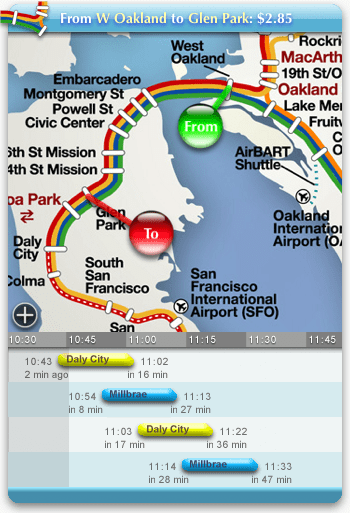
As a result of dropping differential equations this quarter I decided to start a 10 credit independent study on transit information usability for my urban planning minor. I started doing some preliminary research tonight and stumbled upon the most amazing widget I have seen (http://worrydream.com/bartwidget/).

This widget plans your trip in an easy to understand manner. Just drag and drop your starting and ending locations. It tell you where to transfer and how much the trip will cost. It will even set off an alarm to let you know when you should leave. Its elegant and easy to use. Sorry PC, it only works on macs.

For the past months I have been really interested in how transit information affect a users understand of the service. Transit information ranges from cheap and easy things like adding “frequent service” or approximate headways to bus schedules, to expensive things like implement system wide Nextbus service like what MUNI did.

I’m doing primary research for the next month or so. If you have any information that you think might be useful please let me know.

PS Now that I know how to post on here expect to hear from me more often.

Bejan